
Do you sometimes need help telling what colour something is? That might sound a little strange… Who needs help seeing colour better? After all, red is red, blue is blue, right?
Well, ish!
How we perceive colour is very much affected by it’s context.
As I found out the hard way while stitching my Royal School of Needlework (RSN) silk shading module…
Colour choices for silk shading
My goal for the silk shading module of the RSN Certificate was to stitch a photo-realistic embroidery. Which of course includes an accurate representation of the colours.
An obvious challenge is that stranded cotton comes in a finite number of shades..
Check out this post for my initial process of choosing the colours for my flower. As today’s post proves, I had to make additional refinements…
With hundreds of shades across the DMC and Anchor ranges, you’d think every colour you might need would be covered.
Not so!
As I was sampling, it became clear that there were quite large jumps between shades of certain colours.
For example, in the purple-pinks I’m using here:
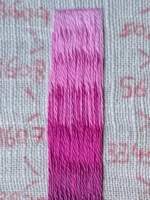
I had a really good hunt for an intermediate shade between the ones that look stripy when stitched together, but couldn’t find one.
So one of the skills I had to hone was using stitches of different colours in such a way as to make the eye see the desired colour and tone.
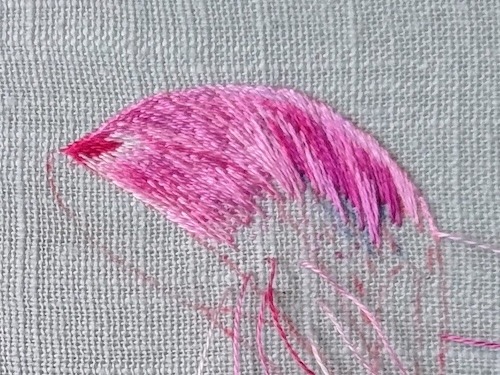
I found it well worth the time to do some sampling of different sections before stitching them.
For example, this sample guided me towards using more of my purple shades as I worked to the right of the petal.
This leaf is green, right?
Then the leaf gave me even more challenges!
In particular, getting the colour right on the section to the left where the light is hitting it.
In my first colour selection, I just had shades of green and green-grey.
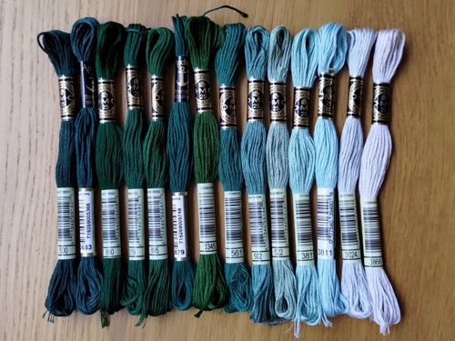
Which allowed me to get the right tones, but the colour was looking rather washed out.
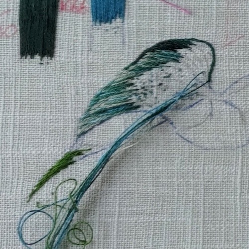
One of my tutors then said that she saw this section as quite blue. So we added some blue shades to my colour palette.
I then had another go at sampling this part of the leaf.
But this time I got a bit carried away with the blue making this section of my leaf look too vibrant…

And this is why we sample!
After my sampling experiments, I knew to take an in between approach. I used more blue than my first attempt. And mixed it with more of my green and green shades than my second attempt.
The trick that really helped
Another tutor also showed me a trick that was incredibly helpful.
And incredibly simple to do!
She covered the majority of the leaf in my photo with a piece of white paper.
Suddenly I could see the colour of this section so much better.
Easy and genius!

This is so effective because with less input, my brain could see what was actually there. Rather than what it thought should be there.
I think the trouble here was two fold.
First, my brain “knows” it’s a green leaf and so wants to see green.
Second, the colour we perceive is relative. Meaning the colour we see is affected by the colours around it.
Another way you can use this trick is to cut a hole in a piece of white paper. You then move this hole over whichever part of your reference image you’re working on to get a clear view of the colours in just that particular section.
Stupidly simple, surprisingly effective!
The colour in context on my leaf
Here are some photos of the progress on my leaf.
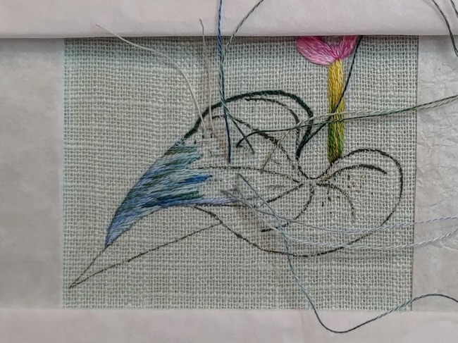
One of the big challenges for me is that the colour/form can look wrong when I’ve only got a little bit of stitching in place.
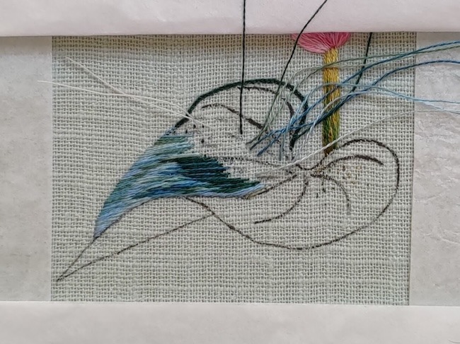
Even with the white paper trick, I still wasn’t entirely sure if I’d got the colours right until more stitching was in.
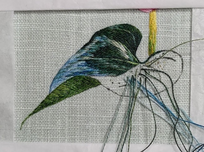
And while I did do a little bit of unpicking, on the whole, this trick really helped me to stitch a leaf I’m happy with.
So I’ll definitely be using it again!
This speaks to me. I’m using a photo I took off Never Castle for my Canvaswork module. I need shiny threads for the water. I cannot get the correct share of grey/ green. I’ve tried silks and DMC. It’s driving me by batty
I feel your pain India. Good luck with the canvaswork, I’m sure you’ll do a great job! In the end I had to tell myself that I was doing the best representation that I could. There are parts of my silk shading which could definitely have been stitched as more accurately reflecting the reference image, but if I felt that the embroidery worked well in on its own then I was ok to let that go 🙂